


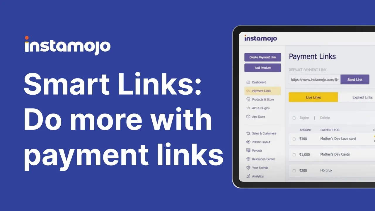
Smart links
A Payment Link for Small Business
Smart Links achieved a 24% increase on link based revenue with 10% organic adoption within 90 days validating product market fit.
Industry :
Fintech
Role :
Product Design
Platform :
Web/responsive
Company :
Instamojo

Context :
Instamojo is an online platform that allows anyone to collect payments with a simple, shareable link.
Sellers use the simple Payment Links, created from the dashboard by inputting a "Purpose of Payment" and "Amount".
Customers then make payments using their choice of payment options like credit card, debit card, net banking, or UPI.
Problem :
Service sellers were hacking around the system by creating products on our store and using those as payment links instead.
The "Purpose of Payment" is just 30 characters long
There is no way to describe the service or the product for which the payment is being made.
No option to add images.
The payment amount cannot be changed by the customer.
Research :
Approach
What I Discovered
I needed to understand what sellers actually wanted. Cold calls didn't work they were too busy. So I sent a survey with an optional phone number field. It worked. I got 90 responses and had 15+ quality conversations
Finding 1:
Sellers needed to tell their customers what they were paying for.
"I sell services by making products on the online store so that the customer can get more information about the service."
"My students want to see more information about the course they are paying for."
"I send a breakdown of the payment in an email and attach the Payment Link there."
Finding 2: Collect Information From Customers
Current process was manual and messy. Sellers wanted to collect this on the payment page itself.
"Once the payment is made, customers send me their shipping address via SMS or Whatsapp."
"Customer sends me their GST information so that I can make the invoice for the payment."
Finding 3: Control Over Links
Links needed expiry dates and capacity limits, not just fixed amounts.
"I conduct workshops and have a fixed batch of students so I need to control the number of students paying on the Link."
"I need to sell early bird tickets, so I need to expire the Payment Link on a particular date.
Finding 4: Look Professional
Branding mattered. Trust was built through visual consistency.
"I want to make a good impression on my buyer by looking professional while collecting payments."
"I want the Payment Link to look more like my website."
"I want to customise branding on the payment link page because customers get confused with different branding and do not trust the payment method."
Finding 5: Flexible Payment Amounts
Persona :
I was able to define the users into several groups based on their business
Design Solution :
It was clear that there were a number of things the sellers were doing to get their work done. Even when regular payment links failed to meet their needs.
We decided to create a new “Smart Link” to cover the most common use-cases.
We could come up with several features but we didn’t want to overwhelm the seller. Therefore, we decided to prioritize.
I divided the “Smart Link” into 3 steps:
Step 1: High Business Impact Features
Features that directly prevent revenue loss or enable new transactions came first. Think inventory management (limiting sales) and expiry dates (time-sensitive offers). A business loses money without these.
Step 2: Optional Enhancements
Collecting extra data, branding customization, thank you messages. These are nice to have. They don't break the transaction if skipped, so sellers can choose.
Step 3: Distribution
Help sellers use this link everywhere. Email, social media, WhatsApp. Make it easy to share.
We also renamed "Payment Links" to "Quick Links" for the simpler version. Quick Links were faster to create. Smart Links were the full experience
The Final Experience :
The flow moved from overwhelming to guided. Sellers could create a basic link in seconds or build a fully customized experience if they wanted to.
Validation and Impact :
The flow moved from overwhelming to guided. Sellers could create a basic link in seconds or build a fully customized experience if they wanted to.
Adoption
Smart Links adoption exceeded expectations. 10% of our active user base adopted Smart Links within 90 days of launch.
But the real story wasn't in the adoption percentage. It was in how sellers actually used the feature.
How Sellers Actually Used It
I interviewed power users to understand what they valued. I checked Mixpanel to get data on every new feature we released in Smart Links.
42% of all Smart Links have a thank you note
Sellers wanted that human connection, even through a payment link.
27.9% of Smart Links have a description
Product information mattered. A lot.
19.7% collect shipping address, 19.5% use expiry dates
Time-sensitive selling and logistics were core workflows.
20.7% redirect to a different page after payment
Smart Links became the entry point to their larger workflow.
Even API Users Adopted It
The marketing team who relied on developers to create custom payment links using the API started using Smart Links because it was quicker and had everything they wanted to run campaigns.
"I use Smart Links, my tech team uses the API."
"I want to give loyal customers discounts, so I send them a Link."
"Some customers find it difficult to pay on the website so I just send them a Link."
They chose convenience over customisation.
What Success Actually Looked Like
Most users didn't even know what a "Smart Link" was. To them, it just worked. The features felt obvious. The complexity was invisible.
The feature didn't feel like a feature anymore. It felt like how payments should have worked all along.
Scaling the product
Looking back at all the research, support tickets, and feature requests from v1. I found a pattern in what people were actually asking underneath all these different use cases.
Three things kept showing up: dynamic pricing, customer data, and looking professional.
Smart Links adoption exceeded expectations. 10% of our active user base adopted Smart Links within 90 days of launch.
But the real story wasn't in the adoption percentage. It was in how sellers actually used the feature.
Key Takeaways :
1. When users stop thinking about the tool and focus on their goal instead, you've won. Smart Links didn't feel like a feature, it felt like a natural part of how sellers work.
2. Ruthless prioritization beats feature bloat. By splitting into three steps and letting sellers choose what matters, we reduced cognitive load while maintaining power. It's better to have sellers use 20% fully than 100% partially.
3. User research isn't about validation, it's about direction. The seller quotes didn't just confirm ideas, they shaped every decision. We weren't building features we thought they needed, we were building solutions to real problems they told us about.
4. Behavioral metrics tell the real story. 10% adoption is a metric. But 42% of links having thank you notes tells you that sellers care about connection. That's insight. That's strategy.
5. Meeting users where they are matters. Sellers weren't going to call us back. A survey with a phone number option worked because it respected their constraints and context.